Project Overview
Momentum Movement Academy is a multi-activity training facility offering programs such as parkour, ninja warrior training, and chess.
This project focused on evaluating and improving the website’s navigation and booking experience through usability testing and redesign.
The goal was to identify usability issues and create a clearer, more structured interface that helps users find classes and complete bookings more efficiently.
The Problem
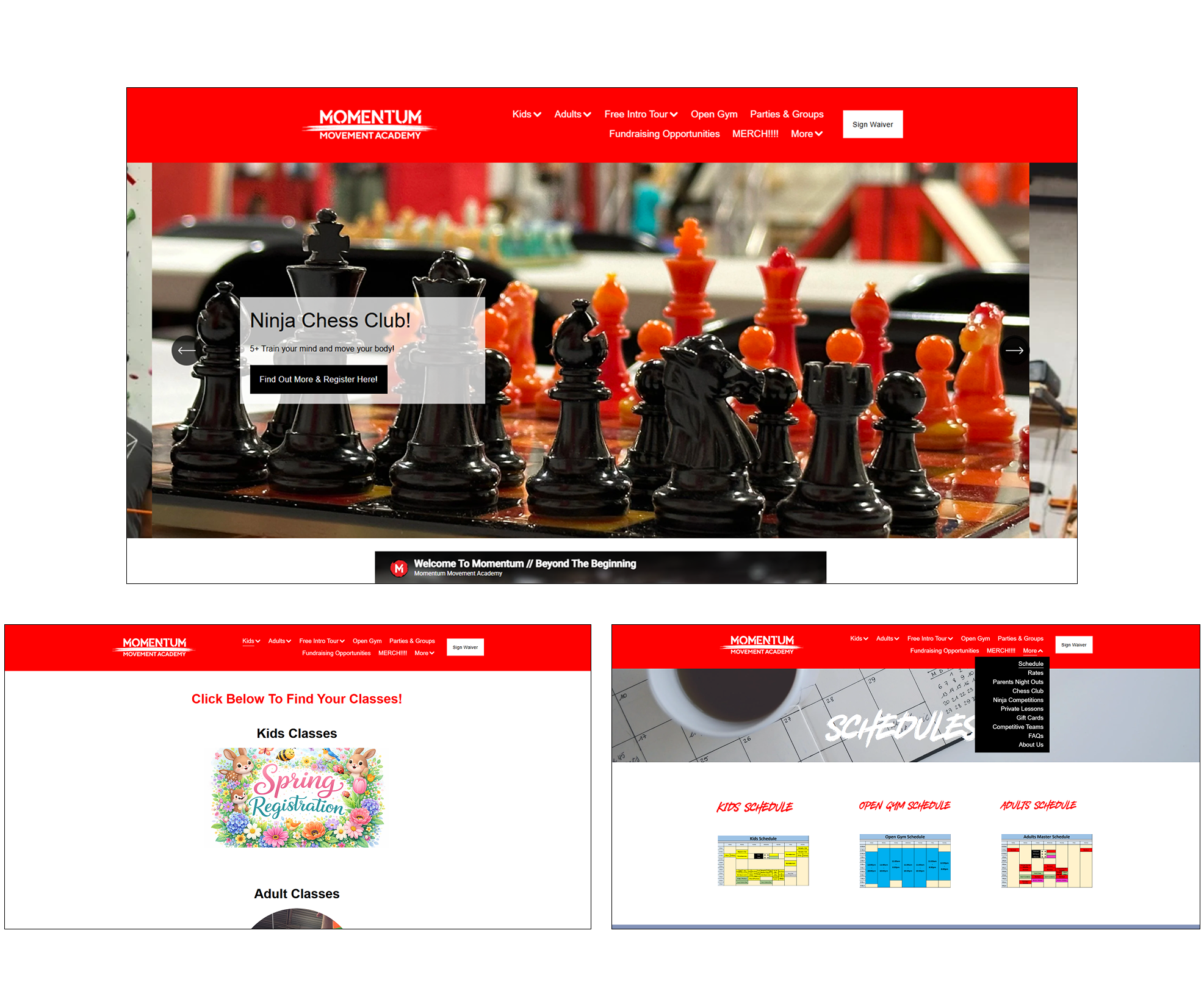
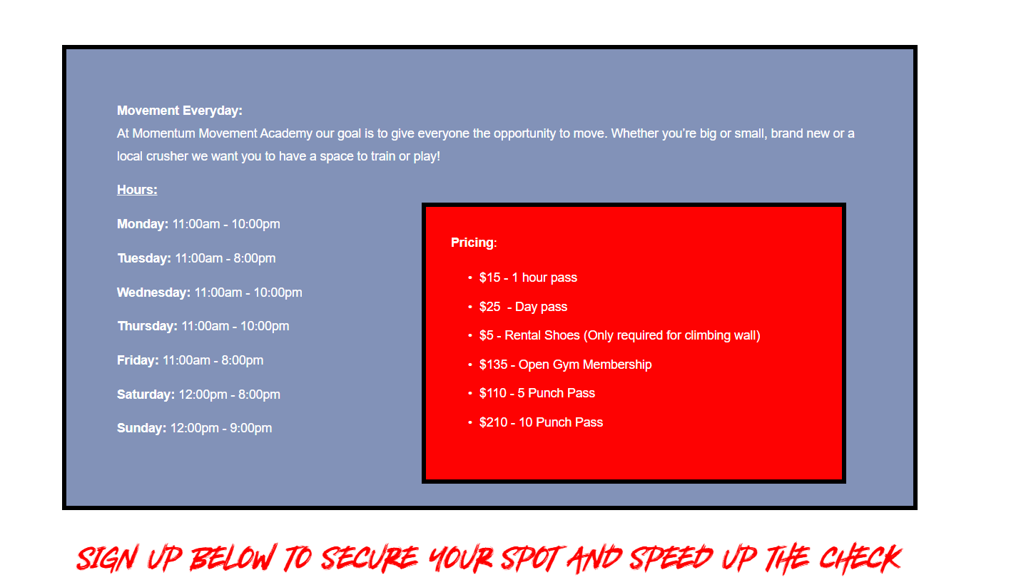
The existing platform is visually cluttered and difficult to navigate.
Important content lacks hierarchy, and users are overwhelmed by excessive information and inconsistent layouts.
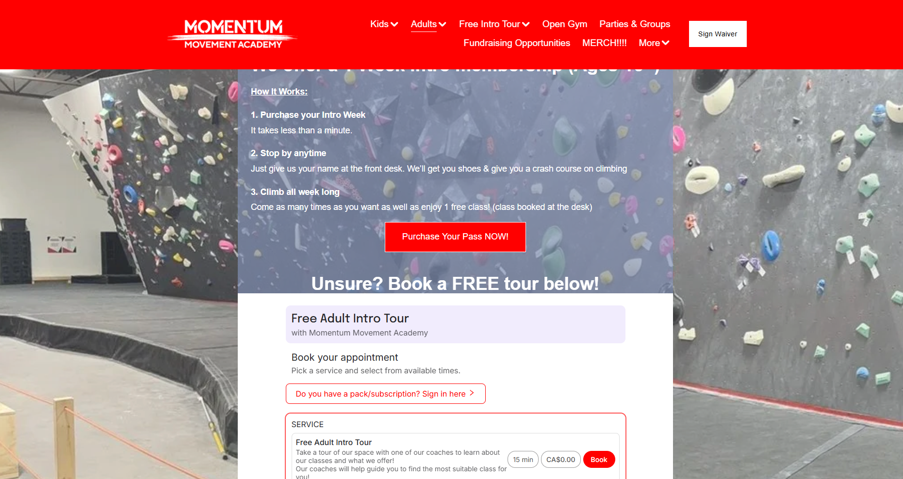
The website presents a large variety of programs within a single interface, resulting in a cluttered layout and unclear navigation.
Users struggled with:
- "Finding specific classes"
- "Understanding how categories are organized"
- "Locating booking pages"
- "Navigating through multiple disconnected pages"
Important actions like booking were not clearly guided, making the overall experience confusing and inefficient
Hypothesis
We assumed that:
Separating class information and booking would make the process confusing
Lack of clear call-to-action buttons would slow users down
A cluttered navigation menu would make it harder to find classes
Research & Testing
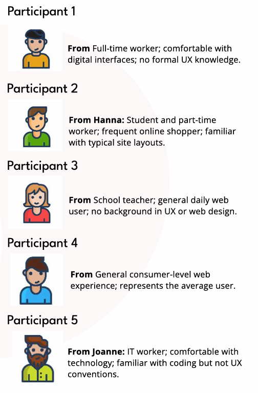
We conducted a moderated usability test with 5 participants using a think-aloud method.
Participants were asked to complete booking tasks such as:
- Booking a class session
- Finding and registering for specific programs
We collected:
- Task completion time
- Observations of user behavior
- Verbal feedback
- Usability ratings (SUS)
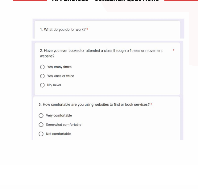
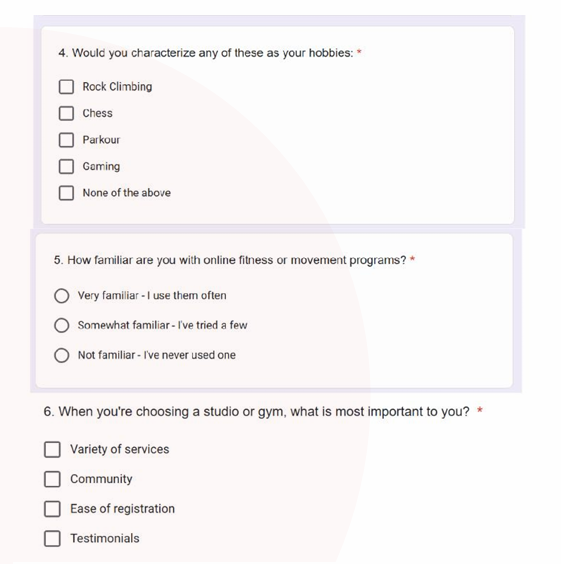
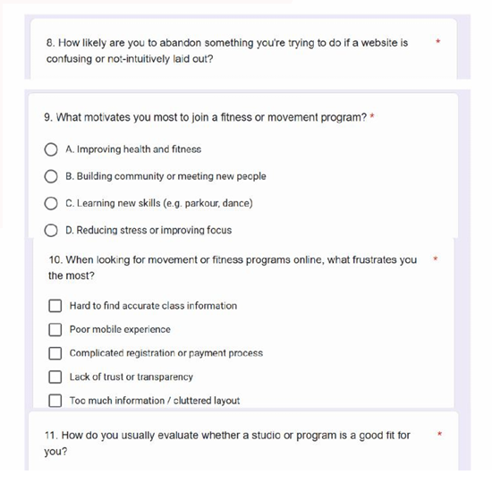
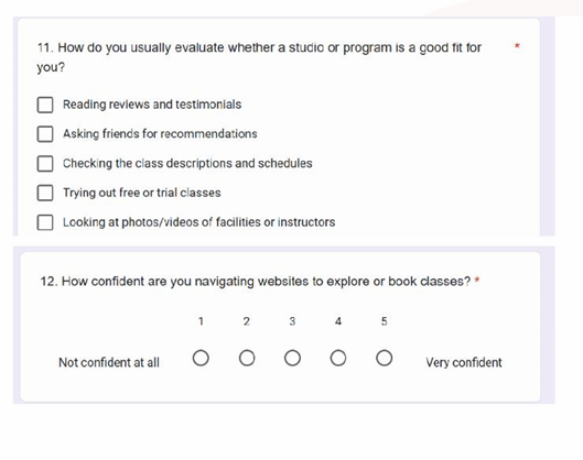
Screener Questions
Data from participants
Key Findings
Key issues observed:
- Confusing and overloaded navigation
- Poor category labeling (e.g., unexpected items under “More”)
- Weak visual hierarchy
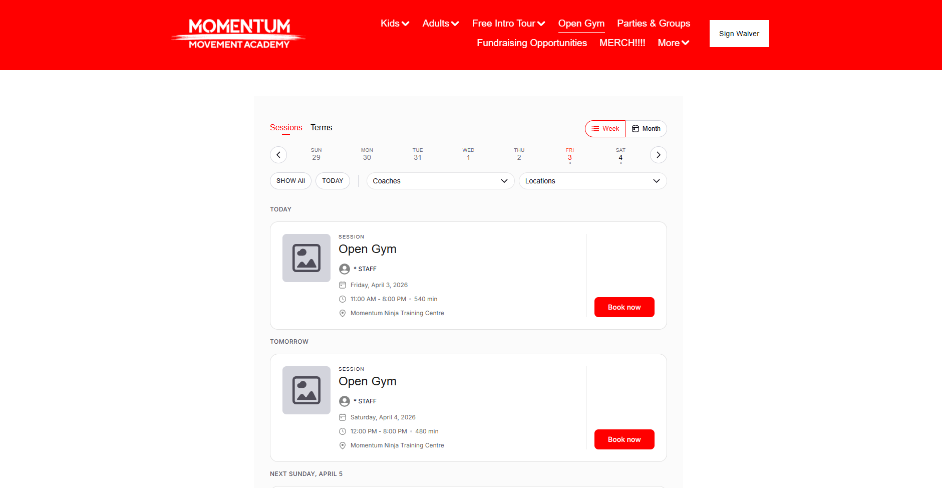
- Disconnected booking flow across multiple pages
While the system was functional, the experience caused frustration and slowed user understanding.
Insights
This shows that:
Good UX is not just about success rate
It’s about how intuitive and confident users feel during the process
Solutions / Redesign
Based on our findings, we proposed:
- Simplified navigation (reduced categories)
- Clear “Book Now” call-to-action buttons
- Grouping class information and booking in one place
- Improved visual hierarchy and layout
- More structured category organization
The redesign focused on creating a more predictable and user-friendly experience.
Prototype
Momentum Movement Academy Prototype
Final Outcome
The redesigned concept improves usability by reducing confusion, simplifying navigation, and guiding users more clearly through the booking process.
This project demonstrates how usability testing can uncover hidden friction points and inform meaningful design decisions.
Reflection
This project strengthened my understanding of how clear navigation and structured layouts impact user experience. Working in a group setting also helped me improve communication, collaboration, and decision-making throughout the design process.
I learned the importance of aligning design choices with user needs while balancing different ideas within a team. This experience reinforced my ability to create more intuitive and user-centered interfaces.
Skills Applied
User Research & Analysis
Conducted competitive analysis and identified usability issues to inform design decisions.
Information Architecture (IA)
Structured content and improved navigation flow to enhance clarity and usability.
Wireframing & Prototyping
Developed low- to high-fidelity wireframes and interactive prototypes using Figma.
Usability & Interaction Design
Applied visual hierarchy, layout principles, and intuitive interaction patterns to improve user experience.
Collaboration & Communication
Worked within a team environment, contributing ideas, aligning design decisions, and communicating effectively throughout the project.